
Analysis mode: Detailed (variable + plots + statistical tests)#
Audience: everyone (best for computational users; still accessible for wet lab)
Time: 20–40 minutes
What you’ll learn:
How Detailed mode compares pages for a chosen variable
How to choose the right plot type for categorical vs continuous vs gene expression
What summary statistics and statistical tests are shown (and their limitations)
How to export plot data as CSV
Prerequisites:
A dataset loaded
At least one highlight page (Detailed compares pages)
For gene variables: gene expression available
What Detailed mode is for#
Detailed mode is the “one variable, many pages” workhorse.
You use it when you want to answer questions like:
“Does
cell_typecomposition differ between these pages?”“Is
pct_mitohigher in Page A than Page B?”“Is gene
CXCL8more expressed in this page than the rest of the dataset?”
Compared to Quick:
Quick gives fast aggregated summaries.
Detailed gives plot choice + customization + side-by-side comparisons + tests.
Inputs (what you choose)#
Detailed mode has three core inputs:
1) Variable#
You choose one variable from:
Categorical obs (labels)
Continuous obs (numbers)
Gene expression (a gene)
2) Pages (“Compare pages”)#
You select which highlight pages are included in the comparison.
Detailed also supports derived pages:
Rest of <page> (the complement of a page across the whole dataset)
Common workflow:
select 1–4 pages for comparisons,
or do one-vs-rest by selecting
Page AandRest of Page A.
3) Plot type#
Plot types depend on variable kind:
Categorical variables: bar/pie/heatmap-style comparisons
Continuous variables (including genes): violin/box/histogram/density-style comparisons
Plot options live in the expanded/modal view (recommended for real work).
What you get (outputs)#
Detailed mode provides three layers of output:
A) The plot (main visualization)#
The plot visualizes the distribution of the selected variable across the selected pages.
Examples:
categorical → grouped/stacked bar plot
continuous → violin plot per page
gene expression → distribution plots per page
B) Summary statistics (table)#
The summary table is meant to be “readable truth” even when plots are ambiguous:
For categorical variables: per-page category counts/percentages (limited to the most common categories in the table view)
For continuous variables: per-page count/mean/median/min/max/std
C) Statistical annotations (tests)#
If you select at least 2 pages, Detailed shows statistical tests appropriate to the variable kind:
If the variable is categorical#
Pearson chi-squared test for a general difference in distributions when every expected cell count is at least 5 (effect size: Cramér’s V)
Fisher’s exact test is selected automatically for a 2×2 table when any expected cell count is below 5
Fisher reports a two-sided exact p-value and a sample odds ratio whose group/category contrast is shown on the result card
A larger sparse table is shown as N/A rather than given a potentially misleading Pearson p-value; combine scientifically compatible sparse categories or use an appropriate exact test outside Cellucid
If the variable is continuous (including genes)#
If you selected exactly 2 pages:
Welch’s t-test with Welch–Satterthwaite degrees of freedom (effect size: Cohen’s d)
Mann–Whitney U (effect size: rank-biserial r)
exact two-sided p-value when both groups have fewer than 50 finite values and there are no ties
otherwise a tie- and continuity-corrected asymptotic p-value
the result card reports the p-value method
rank-biserial direction is reported as group 1 versus group 2
If you selected 3+ pages:
One-way ANOVA (effect size: η²)
Kruskal–Wallis with tied-rank correction and a chi-squared reference tail (effect size: ε²)
Non-finite values are excluded before continuous tests. If all remaining values are identical, variance- or rank-based inference is undefined and the affected result is shown as N/A, rather than as evidence for no difference.
Important
These tests are meant for exploratory, interactive comparison.
They treat the supplied cell values as observations, do not model donors or batch covariates, and do not correct for running many variables. For publication-grade inference, export data and use a dedicated statistical workflow.
For analysis-wide scope and assumptions, see Analysis mental model (Pages, Variables, Scope).
Fast path (wet lab / non-technical)#
Goal: “Show me whether these two groups differ in a way I can explain.”
Make two pages
Example:
ResponderandNon-responder(orCluster 3andRest of Cluster 3).
Open Analysis → Detailed
Choose a variable
Start with a clear variable like
cell_typeorpct_mito.
Select the pages to compare (Compare pages)
Read the results
Plot: “Do the shapes look different?”
Summary stats: “Are the medians/means different?”
Statistical tests: “Is it likely a real difference?”
If you need gene-level answers, switch the variable type to Gene expression and choose a gene.
Practical path (computational users)#
Choosing the right plot type#
Bar plot: best default for categorical; use “Percentages” for composition comparisons across different page sizes.
Violin/Box plot: best for continuous distributions; violin shows shape, box shows summary.
Histogram/Density: useful for multi-modal distributions and QC gating.
Reading statistical tests responsibly#
Treat the tests as:
a check for “is there a detectable difference given this subset?”
not a substitute for a designed experiment model.
If you see significance with tiny effect sizes:
consider whether sample size is huge (small differences become “significant”),
and inspect effect size + plot shape, not just p-values.
Gene expression scale matters#
Detailed mode uses whatever expression values are in your dataset:
raw counts, log1p, normalized, etc.
This affects:
the magnitude of mean/median differences,
and how you should interpret “fold-like” effects (especially if values are already log-transformed).
Export (CSV)#
Detailed mode can export plot data as CSV.
Important: exports are plot-type-specific. For example:
distribution plots often export summary statistics per page (not per-cell values),
categorical plots export category counts/percentages,
some plots export binned counts (histograms).
If you need a “raw table of all values per cell”, you may need to export via a different workflow (e.g., in Python) depending on your use case.
Edge cases and pitfalls#
No pages selected / no pages exist → create highlight pages first.
Tiny pages → tests are unstable and effect sizes can be misleading.
Constant values (no variance) → tests can return degenerate statistics.
Many categories → tables may truncate; use bar plot + export.
Missing gene expression → gene variables unavailable or error on load.
Overlapping pages → comparisons are not independent; interpret cautiously.
Troubleshooting (Detailed mode)#
Symptom: “Plot is empty but pages have cells”#
Likely causes:
the selected variable is missing for those cells (all values are missing/non-finite),
or categorical field has no values in those pages.
Fix:
try a different variable,
verify the field exists and is populated,
verify pages actually contain cells.
Interface reference#
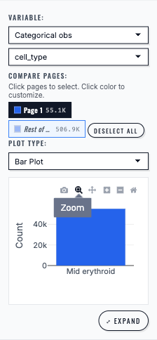
Detailed analysis displays a categorical observation field as a bar plot for the selected page.#
Next steps#
Analysis mode: Correlation (X vs Y across pages) (relationships between two variables)
Analysis mode: Differential Expression (DE) (Page A vs Page B) (gene-level A vs B comparisons)
Exporting analysis results (what each mode exports)
Troubleshooting (analysis) (analysis-wide debugging)